CWD Identity
CASE STUDY
AGENCY: Wizdom Media
CHALLENGE: Create a modern and sophisticated identity to attract a more refined and upscale clientele.
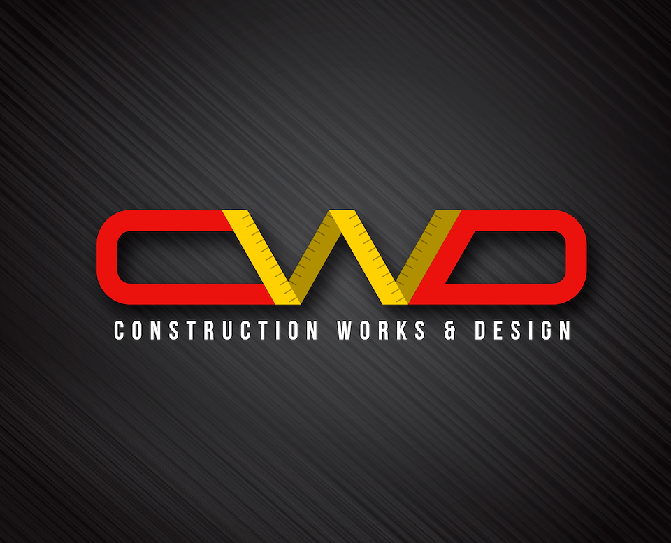
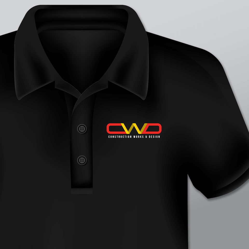
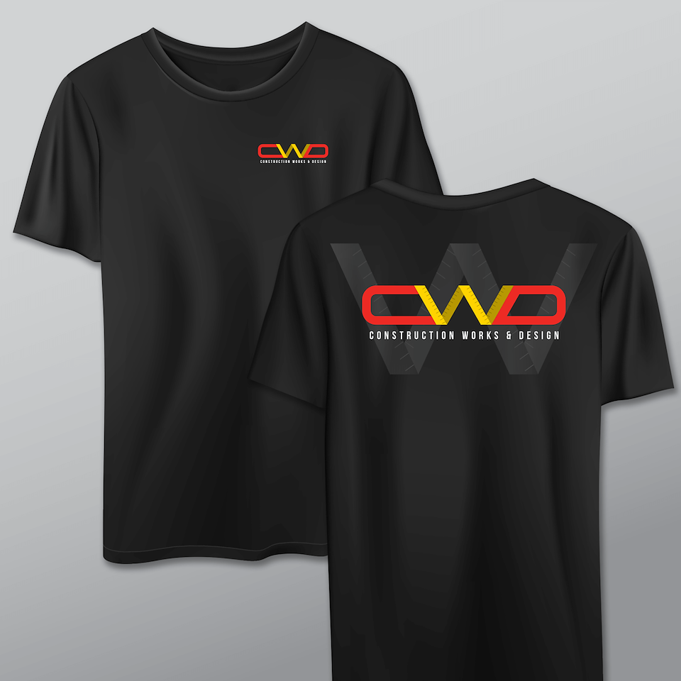
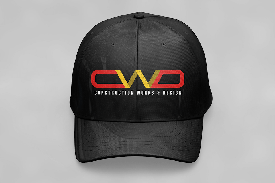
PROCESS: In creating CWD’s identity, I was inspired to blend some traditional construction elements with a modern typeface. Construction projects require a lot of measurements, so I integrated a ruler motif into the design of the “W" to denote precision. I developed a modern looking typeface for the "C” and “D”, shaping them in a way that suggests the handles of power tools. Red, yellow and black were chosen specifically because they are very prevalent colors in power tools, tape measures and caution tape.
DELIVERABLES:
- Logo
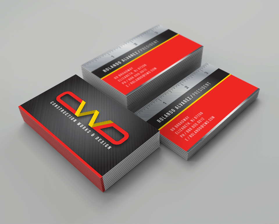
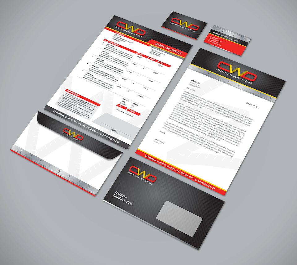
- Business card
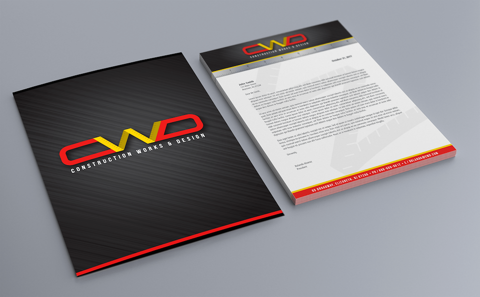
- Letterhead
- Invoice
- Envelopes
- Cap
- Polo shirt
- T-shirt
RESULTS: CWD experienced an increase in projects from a more refined clientele, leading to company growth.
Role |
Branding, Creative Direction, Art Direction, Graphic Design |
For |
Construction Works & Design |